Timeline
What's new?
We're always working on the React Flow docs and the library.
This is a timeline of the things we've added or changed so far.
We're always working on the React Flow docs and the library.
This is a timeline of the things we've added or changed so far.

extent: parent not immediately resolving when parent has width or initialWidth.nodeExtent for internal setNodes.selectionOnDrag is combined with mouse-button-specific panOnDrag settings.Control to activate pane panning with a primary-button drag.useKeyPress.<Background /> pattern offset miscalculation.React Flow 12.11.2 comes with a lot of performance improvements!
XYDrag instance for draggable nodes.MiniMap from re-rendering on every store update.Viewport component only renders once.c707267 - Cache the zoom pane extent so panning and pinching no longer force a synchronous layout.0c0cebc - Use correct fill color for bg pattern in dark mode56cf3b0 - Fix fitView with includeHiddenNodes ignoring hidden nodes that declare an intrinsic size (///) but were never measuredFinalConnectionState type so it preserves the discriminated union.Handle, so a store update no longer runs a selector once per handleWith React Flow 12.11.0, we are excited to introduce the autoPanOnSelection prop. This new feature allows the viewport to automatically pan when a user drags a selection close to the edge of the viewport.
autoPanOnSelection to auto-pan when user drags a selection close to the edge of the viewport.handleId is used without handleType in useNodeConnectionsNodeHandle type@types/react and @types/react-dom as optional peer dependencies to prevent issues with pnpm strict mode (hoist: false)type field to be missing in BuiltInNode (no type field is the same as type: "default")snapGrid to screenToFlowPosition options

We’ve been exploring how to support developers using AI to build React Flow apps.
As part of that, you can now point your favourite LLMs and agents to our new
/llms.txt pages!
The /llms.txt format is a standard file designed to make
it easy for LLMs to navigate documentation without wastefully crawling the entire
site. Think of it like a sitemap but for AI.
This page comes in three flavours, depending on what you need:
/llms.txt is a collection of markdown links and descriptions to
help an LLM find the most-relevant information for the task at hand.
/llms-medium.txt is a single markdown page with all the
content from our “learn” section, as well as the reference material for our
React Flow UI components.
/llms-full.txt is everything we have: all our guides, examples,
and API reference material all in one document.
If you build something using these new resources, or you have some ideas on how we can support AI development, we’d love to hear about it on our Discord server or via email at !
onConnectEnd and isValidConnection up to date in an ongoing connectionzIndexMode to control how z-index is calculated for nodes and edgesexperimental_useOnNodesChangeMiddleware hookFlowRendererOur React Flow UI components have been updated to support the latest version of shadcn/ui, on React 19 and Tailwind 4!
This update includes a fresh look from the latest version of shadcn/ui , and a new UI Components tutorial to get you started.
To upgrade your project, follow the steps below.
npm install react@latest react-dom@latest tailwindcss@latestThis update is huge! We added a new EdgeToolbar component, it’s now possible to start a
selection above a node and child nodes of different parents won’t overlap anymore:
EdgeToolbar componentA new version of React Flow is out. With 12.8.3 you get a lot of bug fixes and a great improvement for handles. It’s now possible to position child content of a handle outside of the handle itself and still use it as a starting point for connections as you can see in this example:
--xy-edge-stroke CSS variable when marker color is nullMiniMapNode to use it for
custom mini map nodesHandleConnection type
for Handle onConnectdefaultValue from Node’s
domAttributes to fix type incompatibility when using 
We have made some significant improvements to React Flow UI (formerly known as React Flow components). These changes enhance the functionality, visual look and usability of the components, to improive the general developer experience.
Some components have been moved to examples, while others have been consolidated in a new structure:
DevTools.Find all of them in the React Flow UI page.
We went over and updated our learn section. Here’s what’s changed:
Our code preview component has been updated with a sleek new design with an action bar that allows you to toggle, copy, refresh or open the code in a sandbox. The default size has also been adjusted in some places to integrate into the text better. Here’s what it looks like:
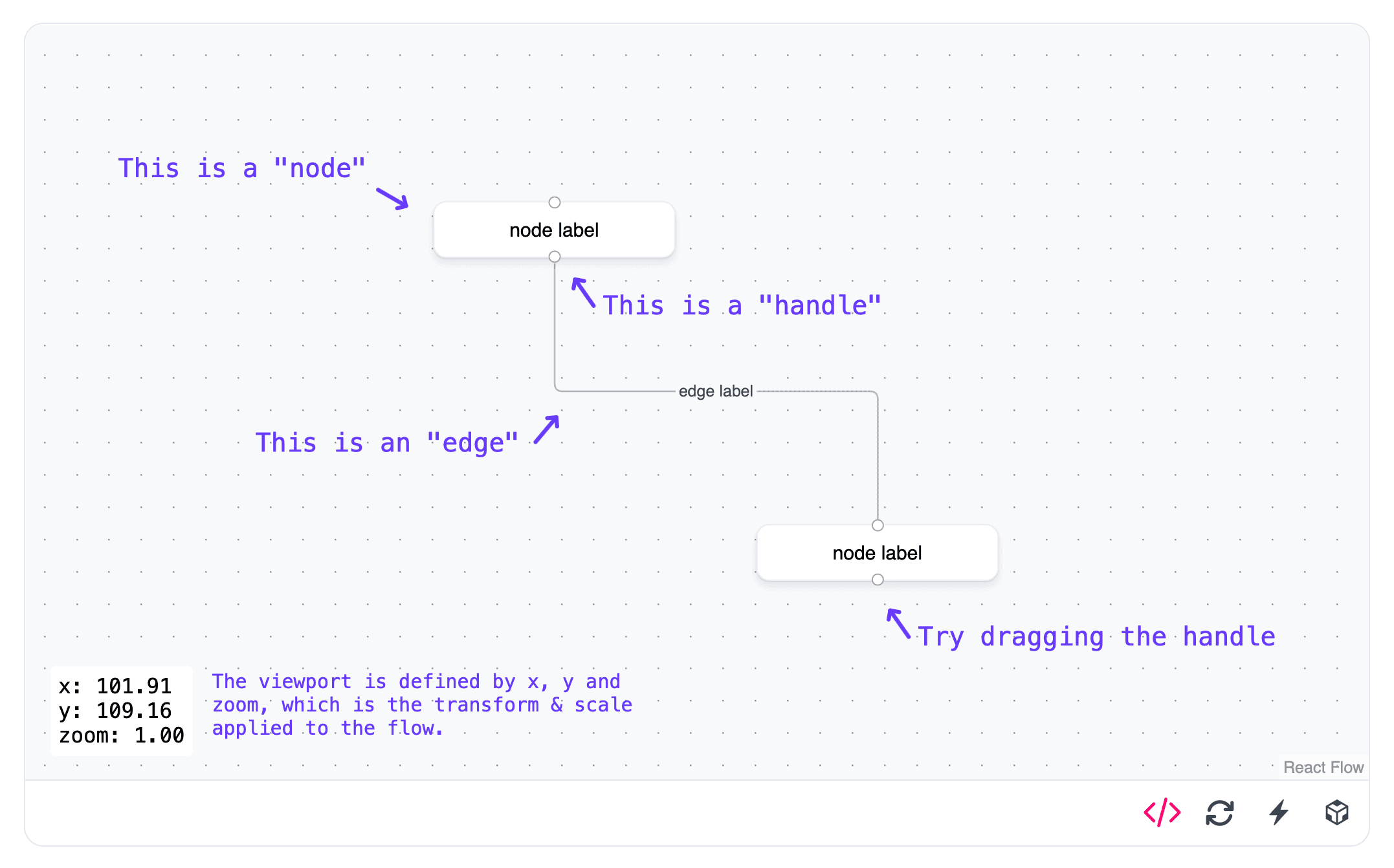
We hope these changes make your introduction to React Flow even better. If you have feedback or suggestions, please let us know via or !
FinalConnectionState parameter to onReconnectEnd prop typesThis release comes with some improvements for a better accessibility and much more:
ariaRole prop to nodes and edgesariaLabelConfig prop for customizing UI text like aria labels and descriptions.domAttributes option for nodes and edgesautoPanOnNodeFocusease and interpolate option to all function that alter the viewportuseNodesData, useReactFlow, isNode and isEdgeuseViewport, useUpdateNodeInternals, useOnSelectionChange, useNodesInitialized hooks and UseOnSelectionChangeOptions, UseNodesInitializedOptions typesReactFlowPropsonNodesChangeBaseEdgePropsuseConnection hookNodeType type argument from ReactFlowProps to connectionLineComponent property.New year, new minor release :) This release contains mostly fixes but also introduces a new useNodeConnections that is the successor of useHandleConnections.
useNodeConnections hook to track all connections to a node. Can be filtered by handleType and handleId.path element attributes to BaseEdge component.We’ve revamped the styles across all our React Flow examples. Plus, we added a new theme file to show you how to customize the style and interactions of your flows.
We think it looks fantastic and can’t wait to hear your feedback. Check out our updated Feature Overview below, along with all of our other updated examples.
We’ve been interested in developing reusable components for React Flow for a while now. With the recent releases of shadcn CLI, we’ve made that happen! Some interesting components from the initial set include:
A database schema node that makes it easy to visualize tables and relationships between columns.
A zoom slider for more convenient control over the viewport zoom level.
Debugging components that make it easier to inspect a node’s properties and the state of your flow.
We’re excited to see what you build with these components, and we’re looking forward to hearing your feedback! Please open issues on our web repo if you run into any problems or have any suggestions for new components, and definitely tweet at us at @xyflowdev if you build something cool with them!
If you want to read the entire release blog post, you can find it on the xyflow blog here .
For a long time now our examples have been built on top of Sandpack . This has been a powerful tool for us to provide interactive examples in our docs but it’s also come at a cost.
We liked Sandpack, but we kept brushing up against some pain points that ultimately we decided we couldn’t ignore.
Our examples were slow to load. Sandpack is an impressive tool, but it is also a heavy one. The Sandpack client itself takes a moment to load, and then if an example included dependencies those would need to be fetched as well. For one-off example pages this wasn’t terrible, but particularly for longer docs pages like our guides or tutorials this could really kill the momentum.
Sandpack didn’t properly support Svelte when we first released Svelte Flow. Ultimately we ended up developing a separate SvelteKit app to host our Svelte examples and adapted our example viewer to switch between Sandpack examples and simple iframe embeds.
Finally, developing new examples was a pain. The source code for our React examples lived in folders deep inside our example viewer component and had special handling of certain files or formats that made authoring examples quite difficult: each change to an example would trigger a hot reload of our docs, which meant waiting for Sandpack to reload and re-render the example again and again.
#4670 Fix initial fitView not working correctly for nodeOrigin other than [0,0]
#4670 Improve fitView to respect clamped node positions based on nodeExtent
#4653 Calculate viewport dimensions in fitView instead of using stored dimensions. Fixes #4652
#4681 Fix crash when deleting nodes while dragging. Closes #4677
d5592e75 Add getNodesBounds to useReactFlow/useSvelteFlow hook as the new recommended way of determining node bounds.Here’s a care drop of new edge examples including how to animate nodes along an edge path, how to create temporary edges, and a demo of every connection event. We hope this new bundle of examples will help you level up your flow game!
This is a breakdown of what’s been added:
Two examples in one showing how to animate SVG elements and other nodes along an edge path.
A new example showing how to create a temporary edge attached to only one handle. These edges can be picked back up and connected at a later time.
We have a lot of events related to connections so we’ve created a small demo showing every connection and event and when they are triggered.
We recently published the findings from our React Flow 2023 end-of-year survey with an interactive presentation of the key findings, using React Flow itself. There were lots of useful bits built into this slideshow app, so we wanted to share how we built it!
React Flow 12 is finally out! With a new package name @xyflow/react!
width, height and handles for the nodes. This makes it possible to render a flow on the server and hydrate on the client: SSR guide
width and height were set by the library as soon as the nodes got measured. This still happens, but we are now using measured.width and measured.height to store this information. In the previous versions there was always a lot of confusion about width and height. It’s hard to understand, that you can’t use it for passing an actual width or height. It’s also not obvious that those attributes get added by the library. We think that the new implementation solves both of the problems: width and height are optional attributes that can be used to define dimensions and the measured dimensions are stored in measured.useHandleConnections and useNodesData and the new updateNode and updateNodeData functions can be used for managing the data flow between your nodes:
We add a new layouting algorithm to our example lineup with the addition of Entitree Flex. This algorithm is similar to d3-hierarchy but allows for sibling nodes as well as nodes with different dimensions.
This example was very kindly contributed by GitHub user @kaustubhxd , thanks Kaustubh! Check it out below.
Sometimes it’s hard to understand what’s going on in your React Flow app. That’s why we’ve added a devtools section to the docs. It’s a copy pastable example that explains how you can get some insights into your React Flow app. We also published a revised version of the feature overview example.
Check it out below!

One of the most common questions we get from users is how to let users edit an edge’s path. This Pro example demonstrates how to do exactly that, by cutting up an edge into segments that can be freely moved around.
We hope folks will find this example and use the same technique to implement features like freeform edge drawing or algorithmic edge routing.
React Flow 12 is finally here We are super excited and hope you enjoy the new features as much as we do. The big topics for version 12 are:
If you want to migrate from 11 to 12 or check out the new features, please refer to the migration guide.
Quite a while back, a user opened a GitHub issue asking us to add the ability to draw multiple connection lines to the library. We don’t have any plans to add this to the library itself, but we hope this example helps folks who need this functionality in their own apps. Check it out here.
Buried away in our API reference is the documentation for our
<NodeToolbar /> component. We’ve been missing
an example to accompany it though, so we’ve published a new example to show how
it can be used. Check it out here.

We’ve been doing this React Flow thing for a while now and between issues on GitHub and conversations on our Discord server , we’ve learned a lot about what our users want and need from the library. It’s a lot harder to hear about people’s experience with our docs or from the large number of users that might not be actively taking part in our communities, though.
In the past we’ve arranged interviews with some of our Pro subscribers to get an idea of how they use React Flow and the Pro Platform and found the insight invaluable. This year we want to expand that to include as many of our users as possible, so we’ve put together a short survey to help steer our direction going into the new year.
It should only take a few minutes to complete and we’d really appreciate it if you could find the time to fill it out. You can find the survey here and we’ll be publishing the results early in the new year!

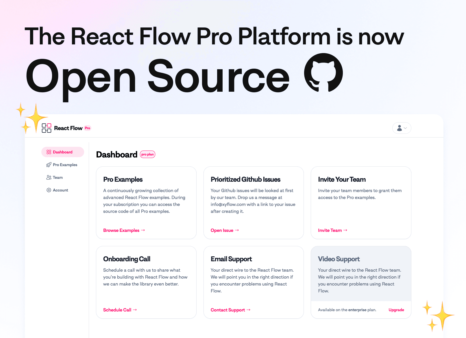
We fund our open source libraries with React Flow Pro subscriptions. Subscribers get access to our Pro Platform where they can view advanced examples, contact us for 1:1 support, and help us prioritize GitHub issues. So far that code has been private but we’ve rebuilt it from the ground-up, added features, refreshed the design, and gave it the MIT License it deserves.
It’s not plug-and-play at the moment, but we hope that some folks take a look, get inspired for their own projects, and that our Pro Subscribers like the new features we built.
We’ve added a new guide to show folks how to create their own custom edges. This
guide breaks down what the <BaseEdge />
and <EdgeLabelRenderer />
components are for, and shows how to use some of the
path utilities React Flow provides.
You can check it out in the customization section of our learning resources here.
We want to make the migration for v12 as smooth as possible. That’s why we added deprecation warnings for the following util functions:
useReactFlow.project to useReactFlow.screenToFlowPosition⚠️ changes: no need to subtract react flow bounds anymore!
before:
const reactFlowBounds = reactFlowWrapper.current.getBoundingClientRect();

const position = reactFlowInstance.
The “Prevent connection cycles” example shows how to use the
getOutgoers util to check if a new
connection would cause a cycle in the flow. Check it out here.
We refreshed the React Flow docs in November 2023, so things might look a little different around here:
Docs are now called Learn. This section aims to answer the question of “how do I use X?”
API is now called Reference. This section answers the question “what is this thing?” A big change from the previous version of our docs are that all of our types, components, hooks, and util functions now get their own page now.
“How to” blog posts now live in Learn > Tutorials
So far the docs have been growing organically since 2019, without any sort of overarching concept. While we worked on a website redesign, we decided it was time to rethink how folks are using our docs so that we can create a better developer experience. Our hope is that these changes make the docs easier to use for both experienced React Flow users and newcomers.
We also did a change of tech stack along the way. We were using Docusaurus, and now we’re using Nextra . Cool beans.
If you find anything to change or improve, just click on the “Edit this page” link on the right-side of any page in our docs or open an issue over on GitHub .
widthheightinitialWidthinitialHeighta01bb6b - Check if parent node is in node lookup before clamp the position to prevent throwing an error.9b3f390 - Always fire onPanZoomEnd when onPanZoomStart was fired due to a pan-on-scroll wheel tickcdfcbeb - Check for element existence and type before checking property existence in node/edge typeguards.useEffect for StoreUpdater to restore previous behaviourSee our new blog post to learn more about how we added these files to support AI development.
Or do so manually in package.json, and then run
npm installRead more about available codemods in the shadcn/ui Tailwind CSS 4 upgrade guide .
npx @tailwindcss/upgradeImportant: Tailwind CSS 4 is now configured completely in CSS. Instead of importing
your @xyflow/react/dist/style.css file in your App.tsx, you will need to it in your
global.css file, after you import tailwindcss.
// Tailwind CSS 3
-@tailwind base;
-@tailwind components;
-@tailwind utilities;

// Tailwind CSS 4
+@import "tailwindcss";
+@import "tw-animate-css";
+@layer base {
+  @import "@xyflow/react/dist/style.css";
+}
We recommend removing the old js/ts tailwind configuration from your project, and migrating to the new CSS-variable-only configuration.
This can make things a lot simpler: you can configure everything related to your application’s design system and look in a single CSS file.
-import '@xyflow/react/dist/style.css';
import "./globals.css";

export default function RootLayout({
  children,
}: Readonly<{
  children: React.ReactNode;
}>) {
  return (
    <html lang="en">
      <body>{children}</body>
    </html>
  );
}For each component you want to update, you can run the following commands.
If it’s a shadcn/ui component:
npx shadcn@latest add component-nameIf it’s a React Flow UI component:
npx shadcn@latest add https://ui.reactflow.dev/component-nameWritableDraftBaseNode enhancementsOur BaseNode component has been fully revamped, to provide a more consistent experience with shadcn UI , and the rest of our React Flow UI component library.
The new BaseNode component now includes improved styling and wrapper components,
aligning to shadcn UI design principles.
Just like a shadcn UI Card component , the
BaseNode component now exports
BaseNodeHeader and BaseNodeHeaderTitle for the header section,BaseNodeContent for the main content area andBaseNodeFooter for the footer section.This structure allows for better organization of content within the node, making it easier to create complex node layouts.
We have also added a few new components and improved existing ones. Our component pages now include more comprehensive examples that showcase the new features and capabilities of the components. For example:
NodeAppendix component, which can be used to add
additional information or controls to nodes, like a
Node Badge!AnnotationNode component has been moved to an
example usage of BaseNode, to
demonstrate how to style the BaseNode.StatusIndicator now includes a variant with an
overlaying spinner, and improved usage examples.TooltipNode component, has been improved and moved to
NodeTooltip. It is no longer a custom node, but rather
an utility component that you can use to wrap a custom node with a tooltip.You don’t need to pass the selected prop to the BaseNode or its related components
anymore. Styling the selected state is now handled automatically by tailwind CSS
selectors.
However, selected is still a valid prop for nodes in React Flow, and you can still use
it to determine if a node is selected or not in your custom components. If you do not need
the selected prop for custom logic, but you only use it for styling, you can safely
remove it from your components, and you can follow how BaseNode is implemented to
achieve custom styling for your custom selected nodes.
export const BaseNode = forwardRef<HTMLDivElement, HTMLAttributes<HTMLDivElement>>(
  ({ className, ...props }, ref) => (
    <div
      ref={ref}
      className={cn(
        'relative rounded-md border bg-card text-card-foreground'
We hope these improvements make your experience with React Flow UI even better. If you have any feedback or suggestions, please let us know via mail or Discord !
useEdgesuseInternalNodeuseNodesuseNodeIduseNodesState and useEdgesState hooktype UseHandleConnectionsParams and useHandleConnections hooktype UseNodeConnectionsParams and useNodeConnections hooktype UseOnViewportChangeOptions and useOnViewportChange hookuseStore hookinterface GetSimpleBezierPathParams and getSimpleBezierPathtype UseKeyPressOptions and useKeyPress hookWell, you are in for a treat! No more hacks, no more setTimeout or requestAnimationFrame and no more split second frames of unfitted views!
setNodes((nodes) => [nodes, ...newNode]);
fitView(); // it just works.
// adding a new node and fitting the view happens at the same timeYou might have realized that the padding value for fitViewOptions is quite a weird fella! What does padding: 0.3 even mean? Well we don’t know either, so you you can now pass pixel values '25px', viewport percentages '10%' and true pros can now even
const fitViewOptions = {
  padding: {
    /** horizontal */
    x: '100px',
    /** vertical */
    y: '50px',
    /** e.g. top overwrites x */
    top: '25px',
    /** mix and match units */
    left: '15%',
    /** legacy units still work */
    bottom: 0.1,
    /** have a modal on the right that stretches 50% over the screen? */
    right: '50%',
setNodes((nodes) => [nodes, ...newNode]);
fitView(); // it just works.
// adding a new node and fitting the view happens at the same timeBackgroundProps, EdgeLabelOptions, ControlProps, NodeToolbarProps, EdgeLabelRendererProps, EdgeLabelOptions and EdgeTextPropsAnd on top of all that we had an entirely separate app we used to generate the screenshots for our examples overview page!
We were quite happy with how our Svelte examples worked (thank you Peter), and decided we wanted to explore a unified solution that would work for both our Svelte and React examples. In the end, we landed up with something even simpler than our SvelteKit app, dropping the need for a server entirely and instead serving everything from a static site.
We’ve created a single example-apps app in our monorepo that uses vite to serve our examples during development and build them into static files for production. If you’re curious, you can find a plain directory of all our examples over at examples-apps.xyflow.com.
We also made authoring examples easier. Developing examples now more closely resembles developing a standalone app, and we put together a simple scaffold script to help us quickly create new examples:
The scaffold script helps you quickly put together a new example for either reactflow.dev
or svelteflow.dev by copying over the boilerplate. All arguments are _required_.

USAGE:

pnpm scaffold <FRAMEWORK> <ROUTE>

EXAMPLES:

pnpm scaffold react blog/web-audio/demo

pnpm scaffold svelte guides/getting-started

ARGUMENTS:

FRAMEWORK 'react' | 'svelte'

              The framework the example will be written in. This affects where
              the generated files are placed in conjunction with the ROUTE
              argument.

ROUTE string

              The route fragment the example app will be served at when combined
We’ve lost one big feature in the transition: the ability to edit examples directly on the docs site. For some users this might be a big deal, but to compensate we now support opening the examples in StackBlitz in addition to CodeSandbox!
That’s all for now folks . For most people this change should be seamless with a free boost to performance to boot. If we’ve managed to break anything in the migration please let us know by opening an issue , and if you think the changes are excited we’d love if you tweeted about it and tagged us @xyflowdev !
colorMode prop (”light”, “dark” or “system”): dark mode example
There is more! Besides the new main features, we added some minor things that were on our list for a long time. We also started to use TS docs for better docs. We already started to add some docs for some types and hooks which should improve the developer experience.
useConnection hook: With this hook you can access the ongoing connection. For example, you can use it for colorizing handles styling a custom connection line based on the current start / end handles.viewport: This is an advanced feature. Possible use cases are to animate the viewport or round the transform for lower res screens for example. This features brings two new props: viewport and onViewportChange.ViewportPortal component: This makes it possible to render elements in the viewport without the need to implement a custom node.onDelete handler: We added a combined handler for onDeleteNodes and onDeleteEdges to make it easier to react to deletions.onBeforeDelete handler: With this handler you can prevent/ manage deletions.isValidConnection prop: This makes it possible to implement one validation function for all connections. It also gets called for programmatically added edges.autoPanSpeed prop: For controlling the speed while auto panning.patternClassName prop to be able to style the background pattern by using a class name. This is useful if you want to style the background pattern with Tailwind for example.onMove callback gets triggered for library-invoked viewport updates (like fitView or zoom-in)deleteElements now returns deleted nodes and deleted edgesorigin attribute for nodesafter:
const position = reactFlowInstance.screenToFlowPosition({
  x: event.clientX,
  y: event.clientY,
});⚠️ changes: returns { x: number, y: number, zoom: number } instead of [number, number, number].
before:
const [x, y, zoom] = getTransformForBounds(bounds, width, height, 0.5, 2);after:
const { x, y, zoom } = getViewportForBounds(bounds, width, height, 0.5, 2);no changes, just a renaming.
useReactFlow.flowToScreenPosition for completionBesides that we fixed some bugs 🐛 You can find all change in the v11.10.0 Github release .
bun installyarn dlx shadcn@latest add component-nameyarn dlx shadcn@latest add https://ui.reactflow.dev/component-nameselectable attribute for edgesBezierEdge, StepEdge, SmoothStepEdge and StraightEdge componentssourceHandle and targetHandle attributes when those attributes are set. (We used to pass sourceHandle: null and targetHandle: null)nodeDragThreshold is 1 by default instead of 0selectable, deletable, draggable and parentId to NodePropsimport { createRoot } from 'react-dom/client';
import App from './App';
const container = document.querySelector('#app');
const root = createRoot(container);
root.export const nodes = [
{
id: '1',
position: { x: 0, y: 9 },
data: { label: 'A' },
},
{
id:
/* xyflow theme files. Delete these to start from our base */

.react-flow {
  --xy-background-color: #f7f9fb;
  /* Custom Variables */
  --xy-theme-selected: #f57dbd;
  --xy-theme-hover: #c5c5c5;
  --xy-theme-edge-hover: black;
  --xy-theme-color-focus: #e8e8e8;

  /* Built-in Variables see https://reactflow.dev/learn/customization/theming */
  --xy-node-border-default: 1px
/* xyflow theme files. Delete these to start from our base */

.react-flow {
  --xy-background-color: #f7f9fb;
  /* Custom Variables */
  --xy-theme-selected: #f57dbd;
  --xy-theme-hover: #c5c5c5;
  --xy-theme-edge-hover: black;
  --xy-theme-color-focus: #e8e8e8;

  /* Built-in Variables see https://reactflow.dev/learn/customization/theming */
  --xy-node-border-default: 1px
import { Position } from '@xyflow/react';
import { layoutFromMap } from 'entitree-flex';

const nodeWidth = 150;
const nodeHeight = 36;

const Orientation = {
  Vertical: 'vertical',
  Horizontal: 'horizontal',
};
import { MarkerType } from '@xyflow/react';

export const nodes = [
  {
    id: 'annotation-1',
    type: 'annotation',
    draggable: false,
    selectable: false,
    data: {
      level: 1,
      label:
        'Built-in node and edge types. Draggable, deletable and connectable!',
      arrowStyle: {
import { MarkerType } from '@xyflow/react';

export const nodes = [
  {
    id: 'annotation-1',
    type: 'annotation',
    draggable: false,
    selectable: false,
    data: {
      level: 1,
      label:
        'Built-in node and edge types. Draggable, deletable and connectable!',
      arrowStyle: {
This is a Pro example. Get all Pro examples, templates, 1:1 support from the xyflow team and prioritized Github issues with a React Flow Pro subscription.